






A product team ships Spanish, German and Japanese. Every string is translated. Native reviewers sign off. Three months later the German signup rate sits at a third of the English one, the Japanese support queue fills with questions about the billing screen, and nobody can point to a single mistranslation.
Nothing is wrong with the words. The interface is wrong. Buttons that fit English clip in German. A date reads 03/04 and means two different days in two markets. A checkout form asks for a first name and a last name in a market where that is not how names work. The navigation mirrors correctly for Arabic, but the icons inside it still point the wrong way.
Multilingual UX is the discipline that catches all of that before launch. It treats language as a design variable rather than a substitution applied after design is finished, and it is the difference between a product that has been translated and a product that feels like it was built locally.
What multilingual UX actually means
Multilingual UX is the practice of designing an interface so that it works and feels native in every language it ships in, not only the one it was designed in. Translation completeness measures words. Multilingual UX measures whether a user in Osaka or Warsaw can finish a task without ever noticing the product came from somewhere else.
The distinction matters because the two are usually owned by different people. Internationalization (i18n) is the engineering work of preparing a product to hold any language: externalized strings, flexible layout, locale-aware formatting, Unicode throughout. Localization (l10n) is the adaptation work of making it right for a specific market. Most teams do localization competently and start internationalizing a SaaS product far too late, which is why the first non-English release is the one that exposes every layout assumption at once.
The practical takeaway: if the only multilingual acceptance test is that no string is missing, the product will pass the test and still lose the market.
Five things change when the language changes
Five variables shift the moment an interface switches locale, and each one can break a design that was drawn once in English. String length, reading direction, locale formats, typography and density, and tone and register.
- String length. Translated text is rarely the same length as the source, and the shortest strings expand most.
- Reading direction. Arabic, Hebrew, Farsi and Urdu reverse the axis the entire layout was built on.
- Locale formats. Dates, numbers, currency, addresses, phone numbers and names follow local conventions, not the source ones.
- Typography and density. Line height, base font size and character shapes that read comfortably in Latin script do not carry over to CJK or Devanagari.
- Tone and register. Formality is a product decision in German, Japanese and Korean, and getting it wrong reads as rude or as childish.
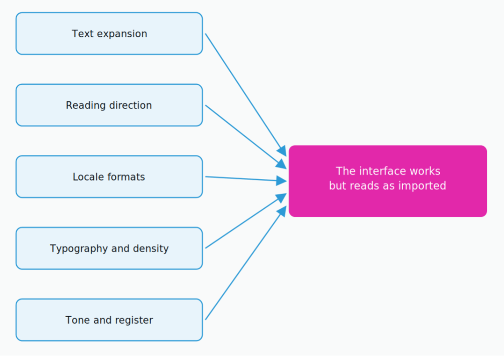
Five variables shift at once. Any single one is enough to make a correct translation read as an import.
None of these are translation errors. Every one of them is a design decision that was made, implicitly, in English.
Text expansion is a design constraint, not a translation defect
Text expansion is predictable, and designs should be sized for it in advance rather than patched after the first translated build. The counterintuitive part is that shorter source strings expand the most, which means buttons, labels, tabs and menu items are the most exposed elements in the product.
IBM’s long-standing guidance, published by the W3C, gives the expected expansion when English is translated into other European languages. A ten-character label can more than double. A paragraph grows by roughly a third.
| English source length | Expected expansion | What it hits | Design implication |
|---|---|---|---|
| Up to 10 characters | 200 to 300% | Buttons, tabs, toggles | Size to 3x, never fix the width |
| 11 to 20 characters | 180 to 200% | Menu items, field labels | Allow two lines by default |
| 21 to 30 characters | 160 to 180% | Tooltips, helper text | Let the container grow vertically |
| 31 to 50 characters | 140 to 160% | Empty states, alerts | Reflow, do not truncate |
| Over 70 characters | 130% | Body copy, descriptions | Reserve roughly a third more space |
Expansion guidance from IBM, published by the W3C. The shorter the string, the larger the multiplier.
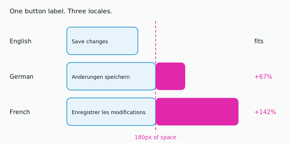
One button label against a fixed 180 pixel container. English fits. German and French do not.
The fix is not to shorten the translation. Compressing a German label until it fits an English-sized button produces a word no German user would choose, which is how interfaces end up accurate and subtly off. Size the component to the longest expected string, let text wrap, and treat an ellipsis as a failure state rather than a layout strategy.
Right to left is a layout mirror, not a text flip
Supporting Arabic or Hebrew means mirroring the layout, not just changing text alignment. The reading axis reverses, so navigation, progress indicators, breadcrumbs, sliders, back buttons and drop shadows all move to the opposite side.
What does not mirror is the trap. Numbers stay left to right inside right-to-left sentences. Phone numbers, version strings, code snippets and email addresses stay unmirrored. Media playback controls follow the media timeline, not the text direction, so a play button that flips looks broken. Logos and brand marks stay as they are.
Directional icons are the most common defect found in review. An arrow that means “next” must flip. An arrow that means “download” must not. Teams that tag icons as directional or non-directional in the design system solve this once. Teams that do not solve it individually, on every screen, forever.
Locale formats are where trust quietly leaks
Format errors rarely block a task, which is exactly why they are dangerous: users do not report them, they just trust the product less. A date rendered as 03/04/2026 means March 4 to an American user and 3 April to almost everyone else, and neither knows the other reading exists.
- Numbers. A decimal comma and a thousands period are standard across much of Europe, so 1.500 can mean one and a half or fifteen hundred.
- Currency. Symbol position, spacing and decimal places all vary, and converting without changing the symbol is worse than not converting.
- Names. First name plus last name is not universal. Requiring both, or assuming the order, quietly excludes users in several large markets.
- Addresses. Postal code position, state or province requirements and line order differ, and a rigid US address form is a visible signal of where a product was built.
The engineering fix is to render every date, number and currency through a locale-aware formatting library rather than a string template. The design fix is to stop drawing form fields that only make sense in one country.
Design the system, not the screen
Multilingual UX scales only when the rules live in the design system, because fixing layout language by language and screen by screen does not finish. Components carry the locale logic, so every new screen inherits it for free.
Tokenize what changes by locale
Line height, base font size and letter spacing are locale variables, not global constants. A team writing in Smashing Magazine documented the practical version of this: Figma’s default 1.2 line-height multiplier falls below the WCAG minimum of 1.5, and Chinese interfaces needed a 16 to 18 pixel base where Western European text sat comfortably at 14. Grouping locales into a few typographic categories keeps that manageable.
Pseudo-localize before a single word is translated
Pseudo-localization replaces source strings with accented, lengthened versions of themselves, so the build renders something like [!!! Sàvé chàngés !!!]. It exposes hardcoded strings, clipped containers and encoding failures weeks before a translator is involved, and it costs nothing to run in continuous integration. Any string that appears unchanged is a string that was never externalized.
Give components a longest-string state
Design reviews that only show the English state approve a layout that has not been tested. Reviewing each component at its longest expected translation, alongside its empty and error states, moves expansion bugs from post-launch triage into design critique.
Not every interface string needs the same workflow
Interface strings do not carry equal risk, so routing them all through one workflow either overspends on low-stakes microcopy or underprotects the screens where a mistake costs money. A tooltip on a settings toggle and the confirmation text on a payment screen are not the same job.
The NEX Translation Matrix™ scores each piece of content on five inputs, content type, business risk, customer impact, regulatory requirement and quality expectation, and routes it to one of three outcomes: AI drafting is sufficient, human linguists refine meaning, or independent linguistic quality assurance runs before publication. The routing rule is worth stating plainly, because it is the part teams get wrong. The matrix routes content, not projects. A single release usually produces all three outcomes at once, so routing happens per string, never per job. In practice that means an AI-drafted string still passes through machine translation post-editing when meaning or terminology needs a native linguist, and a high-exposure string gets a second linguist through linguistic quality assurance before it ever renders for a user.
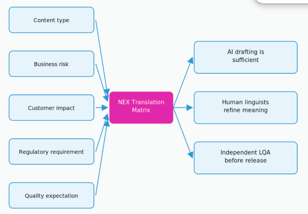
Five scored inputs, three routing outcomes. The matrix runs per string, not per release.
| Interface element | Risk profile | Routing outcome | Review layer |
|---|---|---|---|
| Settings labels, tooltips | Low | AI drafting | Spot check |
| Onboarding and empty states | Medium | Human refinement | Editor review |
| Error and validation messages | Medium to high | Human refinement | Editor plus in-context check |
| Payment and checkout copy | High | Independent LQA | Second linguist signs off |
| Consent, legal, compliance text | High | Independent LQA | Second linguist signs off |
Routing interface strings by risk rather than by release.
Routing by risk is also what keeps the budget honest. Low-risk interface strings sit comfortably in an entry tier at 0.03 per word, while product UI that users transact through belongs in the 0.07 per word band where a native translator and an editor review are standard. NexTranslate publishes transparent per-word pricing with human proofreading included at every tier, which matters here because the cheapest possible per-word rate stops being cheap the moment a mistranslated checkout button costs a week of conversion.
Test the rendered interface, not the spreadsheet
Translation quality cannot be judged in a string table, because the table hides the two things that break most often: how text renders in its container, and what the surrounding screen implies it means. A linguist shown the single word “Open” cannot know whether it is a button, a status or an adjective.
The workflow that fixes this gives linguists visual context inside the tool, runs review on the built interface rather than the export, and re-tests on every release instead of once at launch. That last point is what makes a continuous localization workflow necessary rather than optional: a product that ships weekly reintroduces layout and context bugs weekly, and an annual localization pass will always be looking at a version that no longer exists.
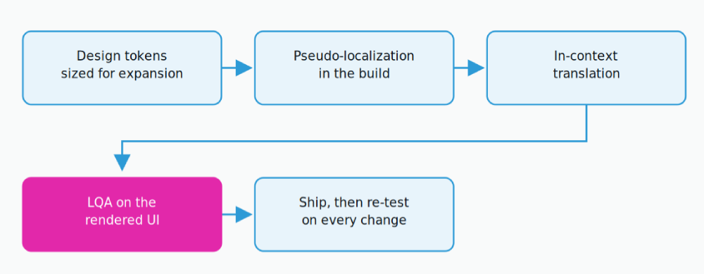
Expansion-ready tokens, pseudo-localization in the build, in-context translation, then LQA on the rendered UI
This is the layer where software UI translation differs from document translation as a service. Interface strings carry placeholders, variables, character limits and code-level context that have to survive intact, and the review has to happen against the running product. The same holds across website and app localization, where encoding, directional rendering and layout verification are part of delivery rather than something the client discovers after launch.
Frequently asked questions
What is multilingual UX?
Multilingual UX is the practice of designing an interface so it works and feels native in every language it ships in. It covers text expansion, reading direction, locale formats, typography and tone, and it sits upstream of translation.
How much extra space should a design allow for translated text?
Plan for 200 to 300 percent on strings under ten characters and roughly 130 percent on body copy, following IBM’s expansion guidance published by the W3C. Because short strings expand most, buttons and labels need the largest proportional allowance, not the smallest.
Is machine translation good enough for interface strings?
It is sufficient for low-risk, high-volume strings such as settings labels and tooltips, and insufficient on its own for anything a user transacts or agrees through. Route each string by risk rather than applying one workflow to the whole release, and add human refinement or independent LQA where the cost of an error is real.
What is pseudo-localization and why does it matter?
Pseudo-localization replaces source strings with lengthened, accented versions of themselves so a build can be tested for localization readiness before any translation exists. It surfaces hardcoded strings, clipped containers and encoding failures early, and it runs automatically in continuous integration.
Do right-to-left languages need a separate design?
They need a mirrored layout, not a separate design. Navigation, progress indicators and directional icons flip, while numbers, phone numbers, code, media controls and brand marks stay as they are. Tagging icons as directional or non-directional in the design system handles this once for the whole product.
When should multilingual UX work start?
Before the first non-English release, and ideally before the design system is finalized. Retrofitting expansion tolerance, mirrored layout and locale-aware formatting into shipped components costs far more, because every screen already depends on the assumptions being changed.
Conclusion: native is a design decision, not a translation outcome
A product feels local when the layout holds the language, the formats match local expectation, the tone matches local register, and the strings that carry risk were reviewed by someone who understood what the screen was asking. None of that comes from translating more words. It comes from deciding, at design time, that the interface will have to hold languages it was not drawn in.
Teams that treat multilingual UX as a translation deliverable ship products that pass review and lose markets. Teams that treat it as a design constraint ship products that users in those markets never think twice about, which is the only real measure of success here.
If your interface is heading into new locales this quarter, we can review the string set, route it by risk and run quality assurance against the rendered build rather than the export. get a quote for your interface strings and we will come back with a workflow and a cost, per string type, not per project.
Written by Karuppusamy Arunachalam, NexTranslate
Published August 2026 . Filed under Localization
